Investigative Study
Investigative Study
Research
Digital accessibility
Printing & bookbinding
Overview:
How does the use of colour in UI affect the accessibility for users with Colour Vision Deficiency and Dyslexia?
For my dissertation, I conducted in-depth research into digital accessibility, colour, CVD and Dyslexia. I also suggested ways that designers can be more accessible to these disabilities.
I decided to focus on dyslexia for this research as there are several people close to me who experience it in different ways. Early in the project I found that there weren’t many studies into digital accessibility for dyslexia, nor were there any formal accessibility guidelines specifically for dyslexia, and I wanted to spread awareness about this issue.
Strategy:
I started the project with secondary research, looking at books, website articles, expert videos and published journal articles.
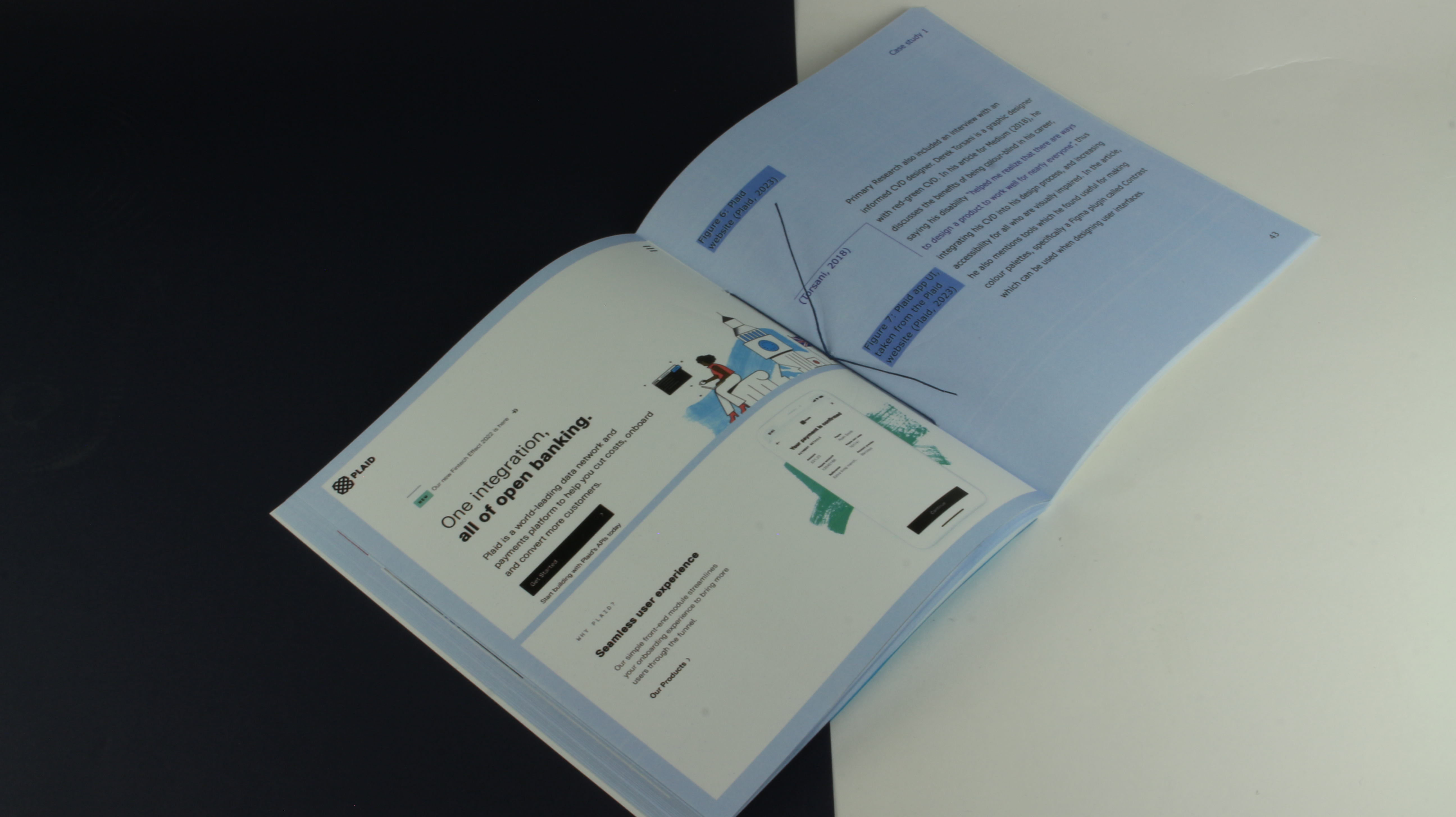
I also conducted primary research through interviews with experts: a graphic designer with CVD and expert knowledge of accessible design, a dyslexic computer scientist and a teacher of children with dyslexia. These interviews were incredibly informative, and are the backbone to my study.
I started the project with secondary research, looking at books, website articles, expert videos and published journal articles.
I also conducted primary research through interviews with experts: a graphic designer with CVD and expert knowledge of accessible design, a dyslexic computer scientist and a teacher of children with dyslexia. These interviews were incredibly informative, and are the backbone to my study.
Development:
The dissertation was challenging to write but great experience for explaining accessibility, and I learnt a lot while researching.
After the dissertation had been written, I designed it into a book. I researched editorial style booklet layouts in the library, measuring the specifications of their page and margin sizes to help me design my own. I decided on an almost-square page layout, with a hang line where the body text must go under. I made sure that all of my text was consistent to the grids and an accessible reading size and simple, clean font; I also needed to make sure there was sufficient contrast between the text and background colours. I decided to print the inner pages on good quality white paper from G.F Smith. I also designed my own icons to use in the definitions page.
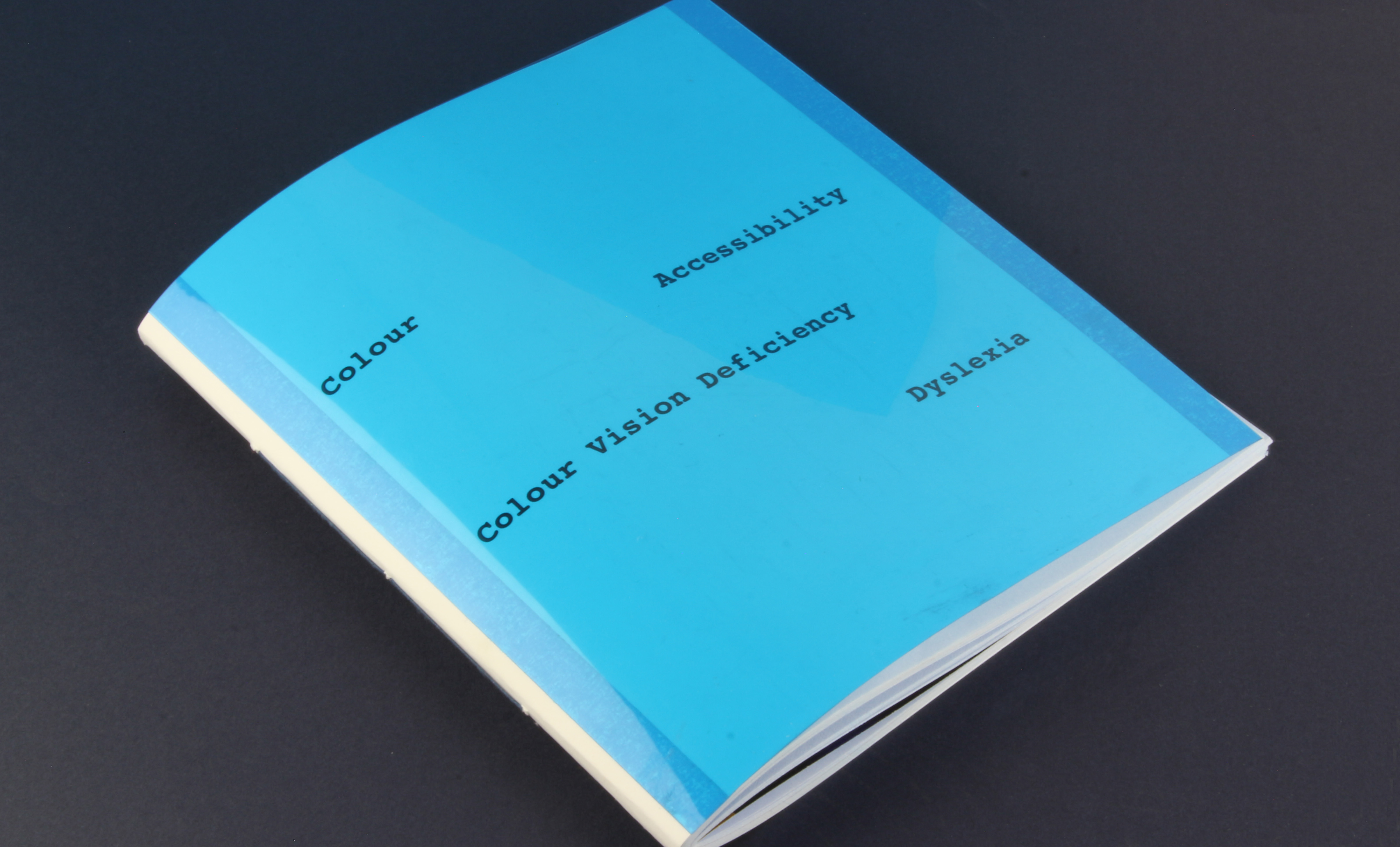
For the front cover, I used a blue dyslexia overlay, as the dissertation focuses on dyslexia and led to my final major project (link here) where I created my own dyslexia typeface. This blue cover complimented the subtle blue of the inner pages as well as protecting the front cover.
I wanted to bind it by hand as this is a process I really enjoy doing, and would look subtle and neat if done well. Using some blue linen thread, I did a simple 3-hole saddle stitch. This was slightly difficult to do with over 20 pieces of thick paper, but it ended up looking really nice.
The dissertation was challenging to write but great experience for explaining accessibility, and I learnt a lot while researching.
After the dissertation had been written, I designed it into a book. I researched editorial style booklet layouts in the library, measuring the specifications of their page and margin sizes to help me design my own. I decided on an almost-square page layout, with a hang line where the body text must go under. I made sure that all of my text was consistent to the grids and an accessible reading size and simple, clean font; I also needed to make sure there was sufficient contrast between the text and background colours. I decided to print the inner pages on good quality white paper from G.F Smith. I also designed my own icons to use in the definitions page.
For the front cover, I used a blue dyslexia overlay, as the dissertation focuses on dyslexia and led to my final major project (link here) where I created my own dyslexia typeface. This blue cover complimented the subtle blue of the inner pages as well as protecting the front cover.
I wanted to bind it by hand as this is a process I really enjoy doing, and would look subtle and neat if done well. Using some blue linen thread, I did a simple 3-hole saddle stitch. This was slightly difficult to do with over 20 pieces of thick paper, but it ended up looking really nice.