Access website
Access website
UI & UX design
Visual identity
Accessibility
Typeface design
Animation
Overview:
Following on from my investigative study of digital accessibility for colour vision deficiency and dyslexia (link here) for my final major project I designed the UI for a website that celebrates accessibility.
WebAIM’s 2022 study of the top 1 million websites showed that over 96% of the websites had accessibility errors. I wanted to design a website that would combat this issue, by listening to disabled people’s voices and experience of using technology and educating designers on how to design more accessibly.
Strategy:
I followed the structure of the double-diamond process (discover, define, develop, deliver) as well as including aspects of the User Experience design process such as user research and user feedback.
To begin with, I conducted a survey on the target users (designers and people with disabilities) to find out what they find visually exciting in a website.
The survey was a very helpful step in the process as I could focus on the user’s preferences rather than my own unconscious biases. It also proved to me that my dissertation topic on colour accessibility would be very relevant for my major project.
Development:
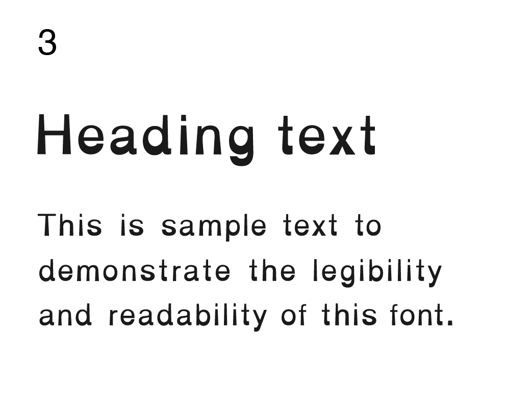
I started the project with my dyslexia typeface. Several of my close friends have dyslexia, and there aren’t many dyslexic fonts that are well known, so I wanted to design a visually pleasing yet dyslexia-friendly typeface.
From my research, I learnt some ways that make a typeface accessible for dyslexia: a heavier baseline to the letters to give the reader a visual focus, making letters easily distinguishable (no imposter letters), and using obvious capitals and punctuation.
From my experimentation, I decided to alter an existing, popular typeface to make it more dyslexia-friendly. I experimented with a few typefaces, but decided on Helvetica.
To make sure that my typeface was valid to use in the website, I conducted a survey with dyslexics. The survey was essential in making sure that my typeface was actually useful.
![My altered Helvetica dyslexic typeface]()
The survey showed that my typeface was valid to use in the website as many people with dyslexia said they preferred it. It also showed me that there isn’t 1 typeface that works for all dyslexics, so I concluded that the users should be able to choose what typeface they are reading the website in.
I started the project with my dyslexia typeface. Several of my close friends have dyslexia, and there aren’t many dyslexic fonts that are well known, so I wanted to design a visually pleasing yet dyslexia-friendly typeface.
From my research, I learnt some ways that make a typeface accessible for dyslexia: a heavier baseline to the letters to give the reader a visual focus, making letters easily distinguishable (no imposter letters), and using obvious capitals and punctuation.
From my experimentation, I decided to alter an existing, popular typeface to make it more dyslexia-friendly. I experimented with a few typefaces, but decided on Helvetica.
To make sure that my typeface was valid to use in the website, I conducted a survey with dyslexics. The survey was essential in making sure that my typeface was actually useful.
The survey showed that my typeface was valid to use in the website as many people with dyslexia said they preferred it. It also showed me that there isn’t 1 typeface that works for all dyslexics, so I concluded that the users should be able to choose what typeface they are reading the website in.


Visual identity:
Next, I started working on the branding of the website. I had chosen the name Access after a class discussion, where we voted for which of my name ideas would work best. The most voted was Access, which is short and sums up the project perfectly.
I experimented with the word in different accessible fonts and styles, before finally deciding on the Bionic Helvetica font. I felt that this logotype was the most striking out of my experimentation, and symbolises the accessibility measures in place on the website for visual disabilities.
The logo mark was something I was also experimenting with - the 2 outward facing arrows are based on the ‘maximise window’ icon on desktop applications, reinforcing the aims of the website which are to ‘maximise’ the awareness of accessibility.

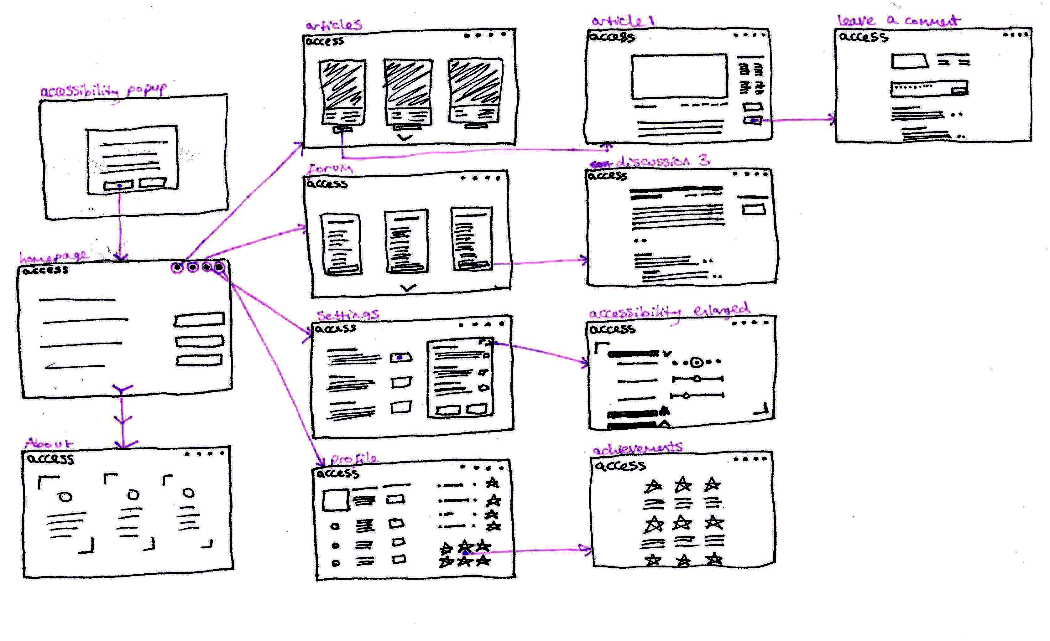
After sketching ideas for the website layout, I designed the UI of the website in Figma. I started with a simple wireframe, which I developed through many iterations and user feedback sessions with dyslexic target users. The user feedback from real target users was invaluable, and helped shape the project immensely.
Final website:
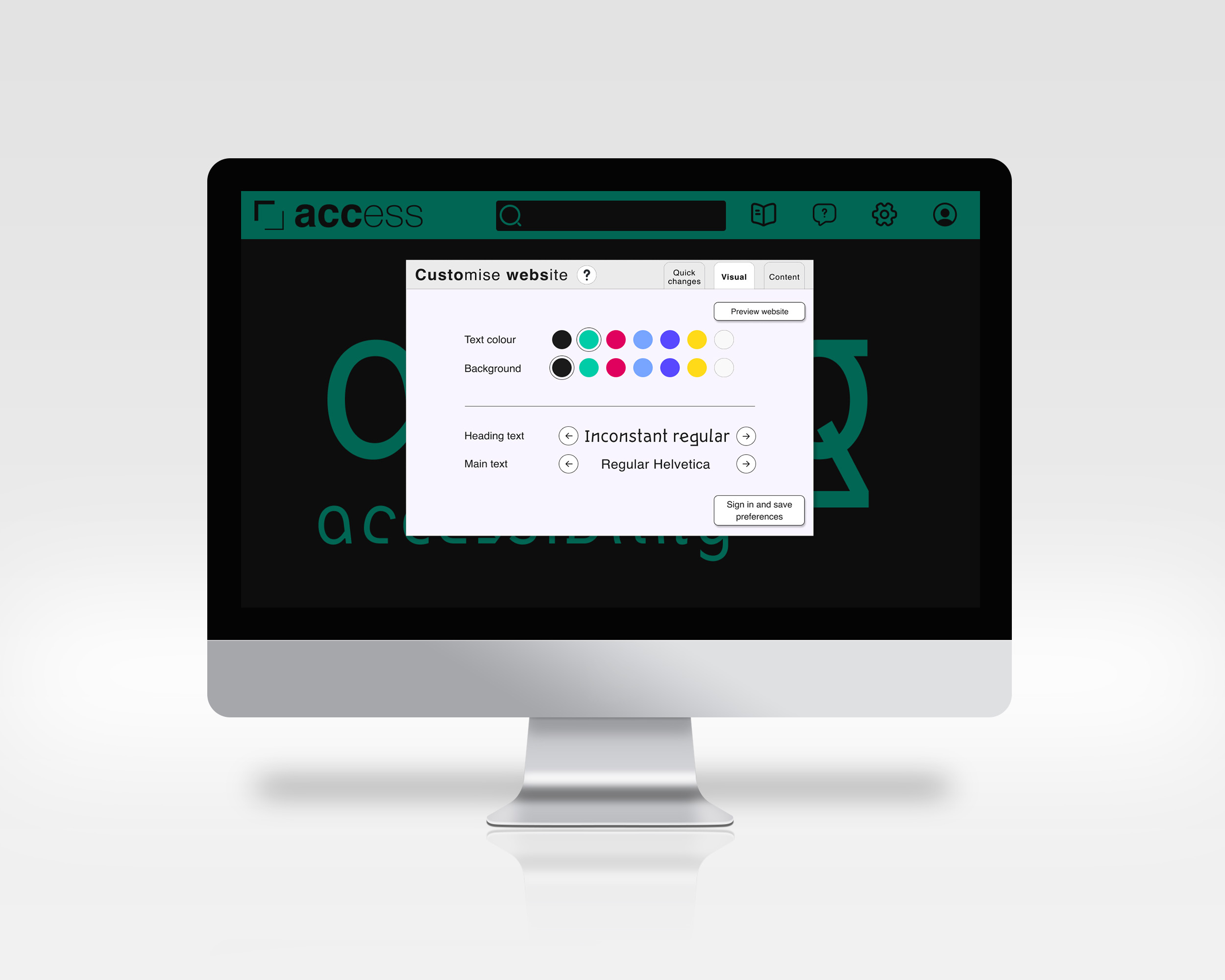
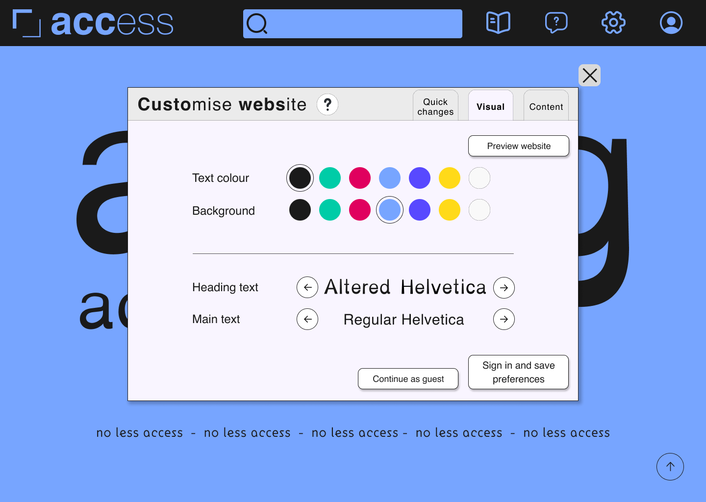
The final website design is one of my favourite projects. The website’s main features are articles that showcase disabled designers’ work, a forum for designers and disabled users to discuss projects and accessibility, and a customisable overlay that allows users to choose how the website looks for them, including colours of the text and background and the typeface. These customisations allow users to have their optimum experience when using the website, as visual disabilities affect every person uniquely.
Additional deliverables:
For my final major project, I also created an animation using After Effects and Premiere Pro to use as an opening animation for the website. I also designed and lasercut some promotional badges that users of the website could wear to show they care about accessibility. Finally, I designed some Instagram posts to promote the website and disabled creators it showcases.
![Lasercut logo badge painted black on a lilac jumper]()
Final website:
The final website design is one of my favourite projects. The website’s main features are articles that showcase disabled designers’ work, a forum for designers and disabled users to discuss projects and accessibility, and a customisable overlay that allows users to choose how the website looks for them, including colours of the text and background and the typeface. These customisations allow users to have their optimum experience when using the website, as visual disabilities affect every person uniquely.
Additional deliverables:
For my final major project, I also created an animation using After Effects and Premiere Pro to use as an opening animation for the website. I also designed and lasercut some promotional badges that users of the website could wear to show they care about accessibility. Finally, I designed some Instagram posts to promote the website and disabled creators it showcases.