

IDEAS Visual Identity
IDEAS Visual Identity
Visual identity
Colour accessibility
Icon design
Print & digital templates
“Working with Orla was an absolute pleasure. She took the time to truly understand what we were trying to achieve with a visual identity, asked insightful questions, and put it all into practice.
She created a complete visual identity on time, on budget and on brief! But also went above and beyond to create comprehensive guidelines and user-friendly templates. These have been so helpful for members of the team with less digital confidence, making it easy for us to apply the brand consistently whilst keeping everything accessible.
Thanks to Orla, we now have a cohesive and impactful visual identity that embodies the spirit of IDEAS. I'd highly recommend Orla to anyone looking for a designer who is creative, collaborative and professional.”
Nicola Beer, Oxford Brookes University
Overview:
The OCAED team at Oxford Brookes University wanted a visual identity for their upcoming project, a curriculum model designed for staff and students.
Important aspects of the brief included accessibility and inclusivity - as this project aims to improve inclusion within course curriculum, it was necessary for the visual identity to be accessible.
The final identity needed to fit within Oxford Brookes’ brand guidelines, but the team also wanted it to be recognisable on its own. As I had experience working with Brookes’ brand guidelines before, this was a welcome challenge.
I worked on this project with my fellow freelancer Farzaneh, who’s website is linked here.
Strategy:
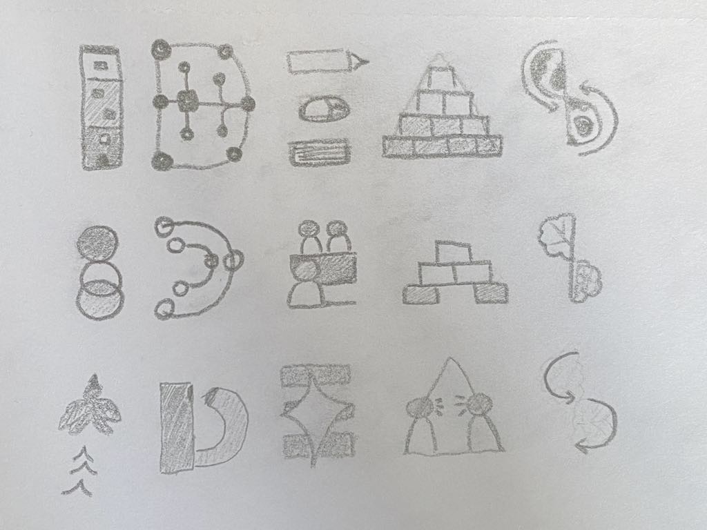
I started the project by mindmapping all of my ideas, including keywords and sketches to do with the brief.
While Fari worked on the logo design and illustrations, I focused on the icons and accessibility. We collaborated on this project very successfully, as our skills matched nicely and we had many meetings to discuss our progress and give eachother feedback.

Development:
After lots of research into the project aims, as well as several meetings with the team, we finalised the icons that would represent the 5 elements of the IDEAS model.
We made sure that they worked in black and white first, so that they could be used in any context.
Next, we experimented with the colours. Using only colours from Brookes’ brand guidelines, we decided on 5 colours, each recognisable and distinct from eachother.
I used the WebAIM colour contrast checker to make sure that all of the colours had an acceptable contrast ratio. It was also important at this stage to check that the colours were distinguishable to people with colour vision deficiency.
Once the team were happy with the icons and colour scheme, Fari started working on the illustrations for the Personas, and I started working on the editable templates.
We created templates for both print and digital, including exercises and presentations.


