Eat Ancient User Interface
Eat Ancient User Interface
UI & UX design
Accessibility
Animation
Overview:
This project was for the RSA student design awards brief ‘Tomorrow’s Menu’, where I worked in a pair.
We identified an issue in the food system which needs more attention: modern grains are being over-cultivated, farmed with strong chemical pesticides which lower soil and harvest quality.
The solution: to encourage the younger adult generation to try ancient grains, which have more health benefits and will re-diversify our diets.
We decided to design an app that teaches 18-28 year olds about the benefits of ancient grains, as well as selling and delivering ancient grain products to their door, and providing recipes with the ingredients.

Strategy:
We both conducted research into food delivery brands and packaging, and in-depth research into brands working on reducing food waste.
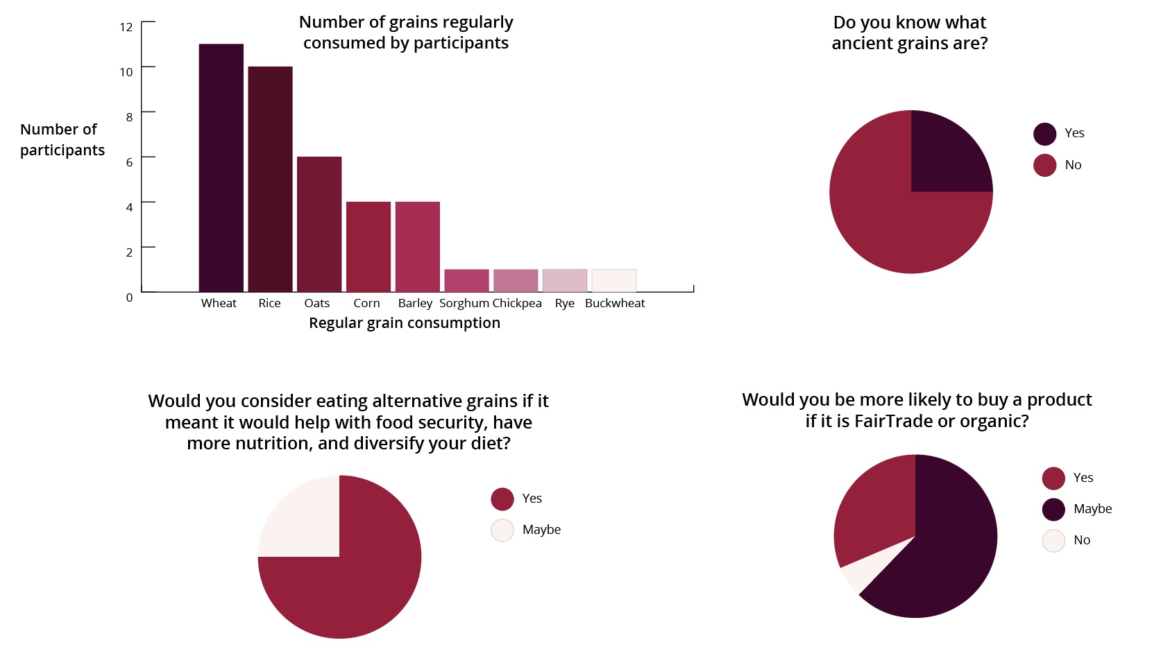
We then conducted a survey on our target audience, asking about their food habits and grain consumption, and recipes they would want to try with ancient grains. This survey provided us with useful data about what our target audience would want in our app.
![Survey results infographic showing target audience grain consumption and opinions on ancient grains]()
We both conducted research into food delivery brands and packaging, and in-depth research into brands working on reducing food waste.
We then conducted a survey on our target audience, asking about their food habits and grain consumption, and recipes they would want to try with ancient grains. This survey provided us with useful data about what our target audience would want in our app.
We wanted to make sure that our work load was equal, so my partner designed the branding and packaging of the products, and I worked on the app and animation.
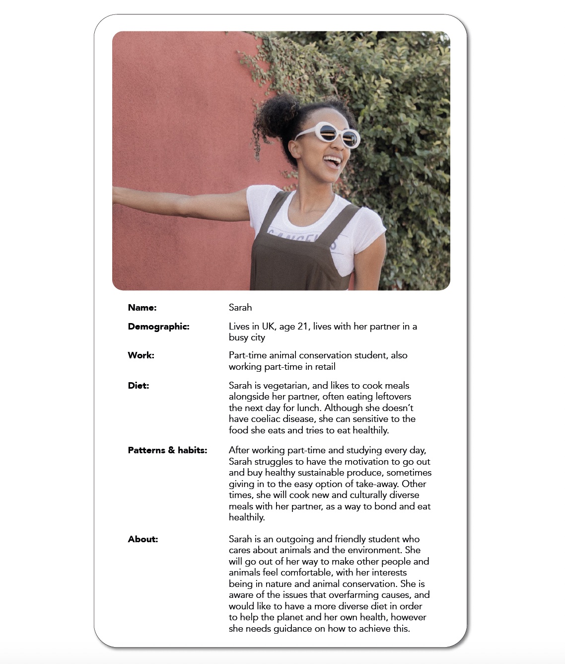
I came up with a persona to summarise the target audience and help me focus the app’s design toward them. I find this is a necessary step as it means we can imagine the user’s habits and needs, and focus on these in the design stage.
Development:
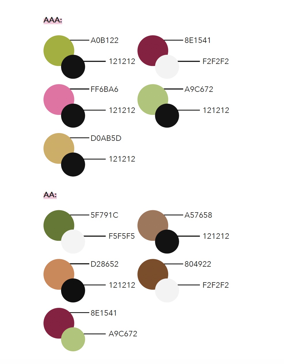
As a designer with a passion for accessibility, I took it upon myself to check the colour palettes we were experimenting with had enough contrast. Using WebAIM’s colour contrast checker, I found certain colour combinations which had AAA and AA contrast ratio, and developed these into our brand’s colour scheme.
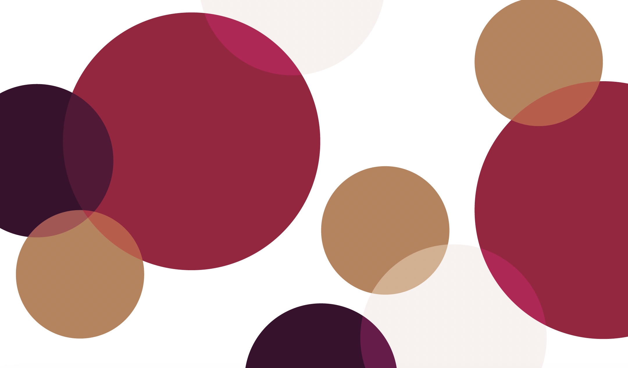
We wanted our brand colours to be a limited colour palette so that it’s bold and stands out, but it also needed to be warm/neutral tones to reflect the colours of the ancient grains. The final colour scheme was designed to be accessible for people with visual impairments, while still being warm and neutral.
The development of the app began with a basic wireframe in Figma, leading to multiple rounds of user feedback to make sure it was meeting the needs of the target users. This is a crucial stage in my design process, as it helps me stay focused on the target users’ requirements and make improvements that they would want.
As my partner was finalising the logo design and packaging of the ancient grains, I finished the app design and made 2 animations of loading screens.
As a designer with a passion for accessibility, I took it upon myself to check the colour palettes we were experimenting with had enough contrast. Using WebAIM’s colour contrast checker, I found certain colour combinations which had AAA and AA contrast ratio, and developed these into our brand’s colour scheme.
We wanted our brand colours to be a limited colour palette so that it’s bold and stands out, but it also needed to be warm/neutral tones to reflect the colours of the ancient grains. The final colour scheme was designed to be accessible for people with visual impairments, while still being warm and neutral.
The development of the app began with a basic wireframe in Figma, leading to multiple rounds of user feedback to make sure it was meeting the needs of the target users. This is a crucial stage in my design process, as it helps me stay focused on the target users’ requirements and make improvements that they would want.
As my partner was finalising the logo design and packaging of the ancient grains, I finished the app design and made 2 animations of loading screens.
Deliverables:
The final deliverables were the app prototype, animations and ancient grain packaging. The project was a great experience to collaborate with another passionate student on a project we both felt was meaningful.
![Anna's finalised logo and illustration design]()
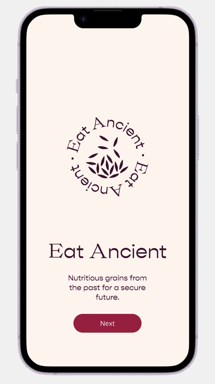
![Eat Ancient onboarding screen, with Anna's logo design]()
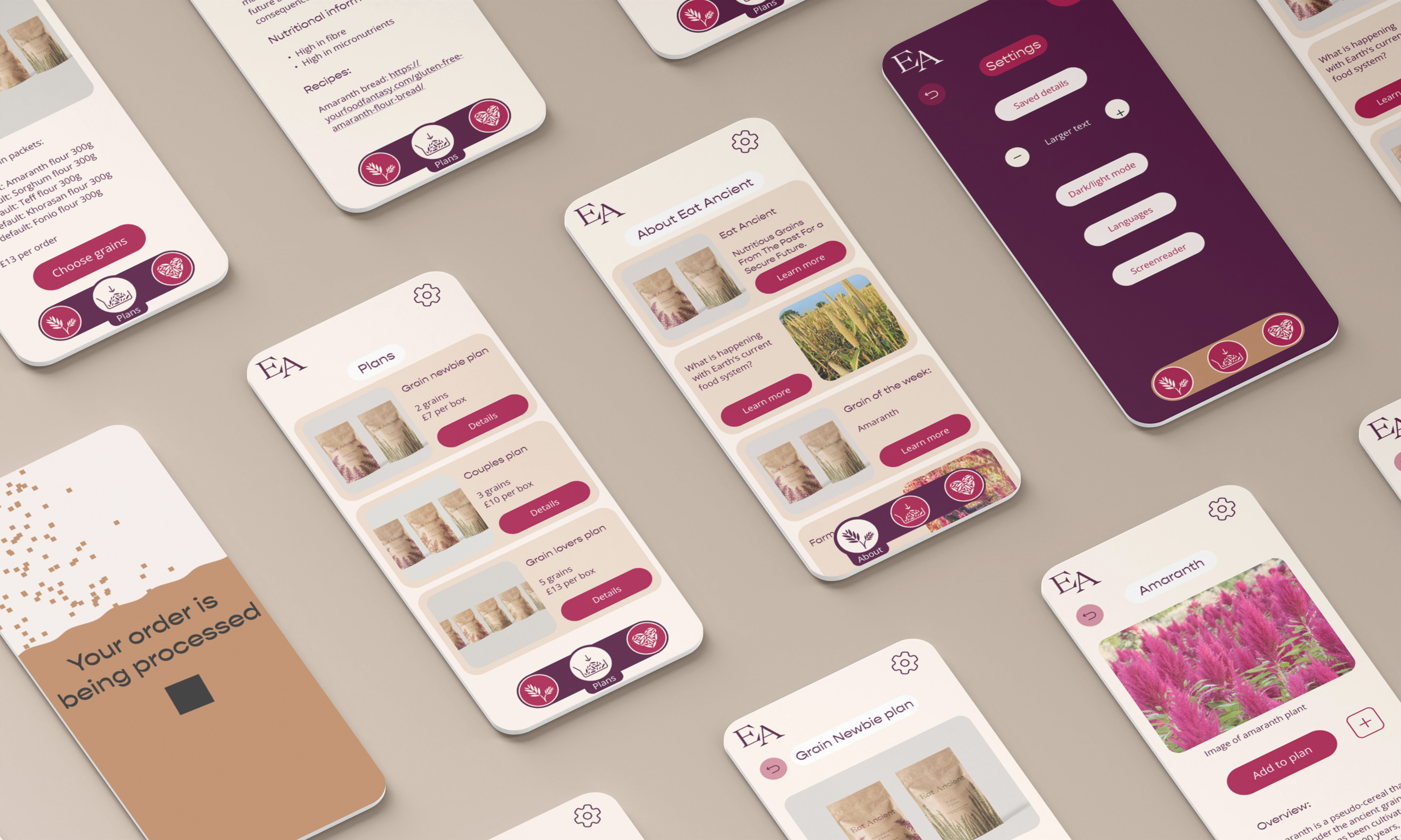
![App landing screen, showing Anna's grain packaging and available plans for delivery]()
![App 'about' page, detailing benefits of ancient grains and giving information on the food system]()
The final deliverables were the app prototype, animations and ancient grain packaging. The project was a great experience to collaborate with another passionate student on a project we both felt was meaningful.